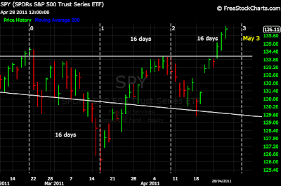
There may be an equal time cycle currently in play. Watch May 3-4 for a major change in trend.
I think we should see some weakness and consolidation prior to May 3rd. However, the equal time cycle suggests this is a candidate for a topping date, and subsequent downturn.
Daily Chart
Thursday, April 28, 2011
Monday, April 25, 2011
$Rifin - Financials Tell
Warning!
It is shocking how badly Financials are underperforming SPX recently. Both SPX and the Financial Index Rifin have been plotted below to show this comparison.
It is a clear signal that a major breakdown is approaching. Financials are leading the market down, and that signal has been intensifying.
60min Chart
Wednesday, April 20, 2011
$SPX - 2007 Cycle Update
Well, here we are back trading in the 1330 range just as the 2007 top cycle suggested. My timing model indicated a bottom on April 15th +/-. The market bottomed in the early hours of April 18th. April 18th was also the day that my VIX chart suggested for a peak in the VIX.
I marked on the following charts with green arrows the equivalent spot where the market surged today. Likely next we should see some whipsaws comparable to the Weekly chart as the topping process completes. It would be unreasonable to expect an exact match in small scale movements and price levels. I want to stress it is the bigger picture that is important.
The market is now acting in a way that is extreme, and this is unusual. However, this is typical just prior to significant trend changes. Be aware, the picture is severely bearish.
15min Chart
The Weekly shows a picture of the drop that the cycle predicts next. It is deceiving as the decline should be much steeper. Freefall!
Weekly Chart
Thursday, April 14, 2011
$SPX - Similar to 2007 Top
In a previous post I had said that we were forming a top similar to the 2007 top due to the cycles. That appears to be the case from the following chart comparisons.
I had also said that April 15th was important +/- in my timing cycles. I thought it would mark a bottom and it did, but it wasn't the large decline just yet. It marked the bottom of a smaller decline at 1303. This is still within the topping process similar to the 2007 top. We should rally back up into the 1330's now.
I am anticipating a freefall to the calculated target at 1206 in May. I will update a timing estimate and explain further at a later date.
10min Chart
This is the 2007 top. Remember, we are trading from right to left.
Weekly
Monday, April 11, 2011
Gold - Potential Top
This may be a potential expanding triangle ending diagonal top for Gold. If so, then volatility in Gold is about to increase dramatically. That would present quick drops, and also strong bounces. For Gold the next target could be $1270-80.
One of the reasons that I feel Gold may be topping out here is that Gold, Oil and many other commodities topped in 2008 after $SPX topped in late 2007. According to my theory, we are "unwinding" that cycle now. Gold, Oil and many commodities should top first, before $SPX, this time. That would indicate a sharp decline in the near term for Gold, with a major lower high forming for Gold as $SPX completes it's final top later this year.
I plan to show more detail on some of the Gold cycles in the near future.
4-hour Chart
Example of an expanding triangle ending diagonal top:

Sunday, April 10, 2011
$SPX - Complex Top
Before the market opened on Friday, I had mentioned that the bottom should fall out of the next dip based on a short term symmetrical pattern. I was referring to the following complex topping pattern.
The tops are symmetrical, and also the time is equal to either side of the cycle line.
15min Chart
$VIX Update:
My previous analysis indicated that VIX should form a triangle prior to a major spike up. The triangle has formed, and the breakout occurred on Friday. Notice that both light blue lines intersect at my cycle line. In my view, this further confirms that I have the symmetry correct.
Watch the light blue line and red arrow!
60min Chart
Monday, April 4, 2011
$SPX - Big Picture - "Unwinding the Great Bull Market"
The cycles are important in my work. When looking at the big picture, my theory is that the market should "unwind" in a similar pattern that it went up during the "Great Bull Market" over the last century.
The following charts show a pattern of how this "unwinding" may now start to occur. As shown in the yellow boxes of the first chart, the cycle may be indicating a "Freefall" to the target at 1206 SPX next (as previously calculated). I have also proposed a triple bottom for SPX as a result of similar patterns in several cycles that I am monitoring.
Following this "Freefall" and triple bottom, I have suggested a strong rally up to 1352 SPX. According to the pattern in the lower chart, this may be the final top prior to commencement of a multi-year bear market. Let's call this the "Great Bear Market".
2-Hour Chart
In the following chart my analysis suggests we are currently at the equivalent of the 2007 top. The market is about to decline to the triple bottom proposed 1206 SPX target by trading down from the Right of the chart towards the Left in a similar pattern. The triple bottom would be point C on the above 2-Hour Chart.
7-Day Chart
Saturday, April 2, 2011
$VIX - Improved 60min Chart
VIX likely has already started to triangulate. The triangle appears to be the setup for an aggressive spike higher in VIX as shown in the symmetry to either side of the cycle line.
The yellow triangle apex marked the timing of the top peak 4 for VIX. Once the blue triangle boundaries fill in further, and are thus better defined, then the blue triangle apex will provide a more precise estimate for the next VIX peak. On this chart the blue triangle apex is approximately April 15th. I had previously estimated that SPX may bottom roughly April 15th. I used another cycle to calculate that date, and the VIX triangle apex is further supporting that timing estimate.
60min Chart
Subscribe to:
Comments (Atom)


